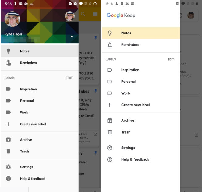
The new look is much more attractive and modern-looking, and as far as we can tell, it loses no functionality in the redesign process. Only the blue thumbtack icon in the corner of pinned items appears to have been lost, though the “pinned” category header is still present, and it’s probably as much of an indicator as you need.
Also Read: Google Keep: Another Google product I won’t use (and why) Note titles are now in Google/Product Sans, and gone is the old serifed Roboto Slab font for note content, replaced by a sans-serif Roboto. The gray background has been replaced with an eye-searing white, and notes are now denoted merely by a border, rather than a contrasting background. There isn’t any major jumps in app version from the old look to the redesign, v5.0.411 compared to the current v5.0.391. Like any other Google product roll out, this one is also in phases. If you update your app but don’t really see the redesign, chances are it is well on its way and you should be getting it in the next few weeks. If you are not too keen to wait for the update to reach your device, you can as well sideload its apk. To get an early look at Keep Notes for yourself, download the latest version at APK Mirror. In-post images courtesy of Android Police

